What are end papers, you ask? In making a hardback book, the block of printed pages is attached to the boards of the cover by glueing a folded sheet of thick paper to both. This sheet is what you see when you open a book to the inside cover. Often it’s just a plain sheet of paper, nothing to catch the eye, but occasionally book designers use it to add a little extra something, a grace note. Here are four from recent books that caught my eye.
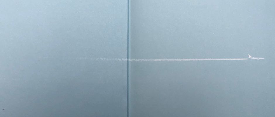
This one is subtle enough that it was only while rereading Rachel Cusk’s Kudos that I noticed it. The airplane and contrail in white against the sky blue of the paper echo the opening of the book, in which protagonist Faye is seated on a plane next to a man who (like seemingly everyone she meets in the novel) tells her an oddly revealing story about his life.
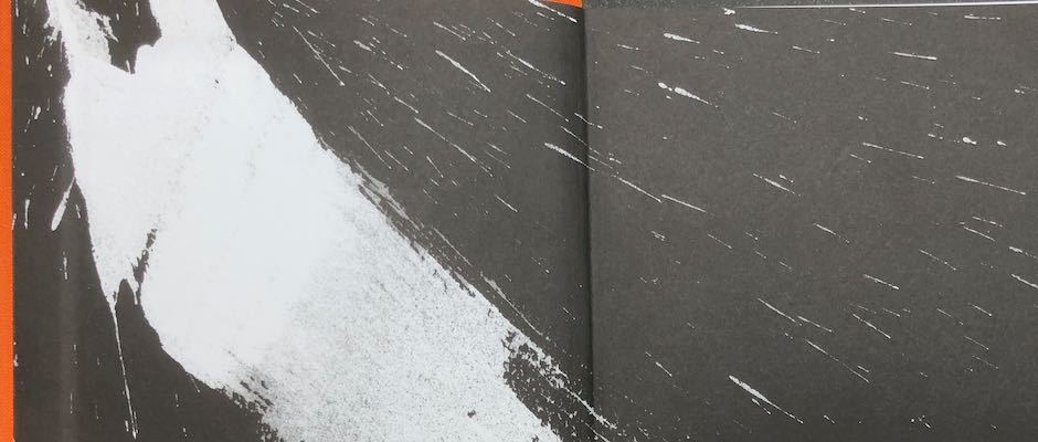
The end papers for Greenfeast: Autumn, Winter (Nigel Slater) continue in monochrome the bold brushstrokes of the orange and gold cover. The calligraphic brushwork theme is continued throughout both the Greenfeast books. Cookery books are often the most beautiful to come from commercial publishers, designed as a feast for the eyes as much as a guide to the cook, and the Greenfeast books are no exception: elegant typography, good quality paper, enticing photography.
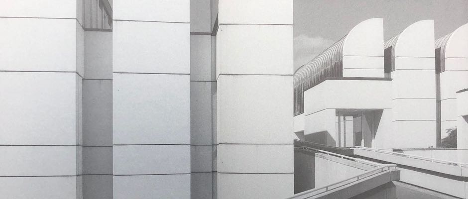
The biography of a famous architect naturally offers great potential to the book designer: the end papers from Fiona MacCarthy’s biography of Walter Gropius reproduce this striking image from the Bauhaus archives.
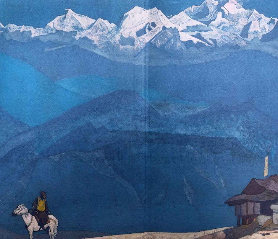
Finally, the one that started me thinking about end papers: this vibrant illustration covers the end papers of Horizon by Barry Lopez. In some ways it might be more at home in an edition of the 1001 Nights than in Lopez’s meditative and elegiac nature writings, but to complain would be churlish — it looks magnificent against the white boards of the cover.


Recent Comments